✨ An Introduction to UI/UX in Shiny✨
Who am I?
Background in Psychology
Data scientist @ Jumping Rivers
R & Shiny development for clients in a variety of fields
Teach beginner & advanced R programming courses

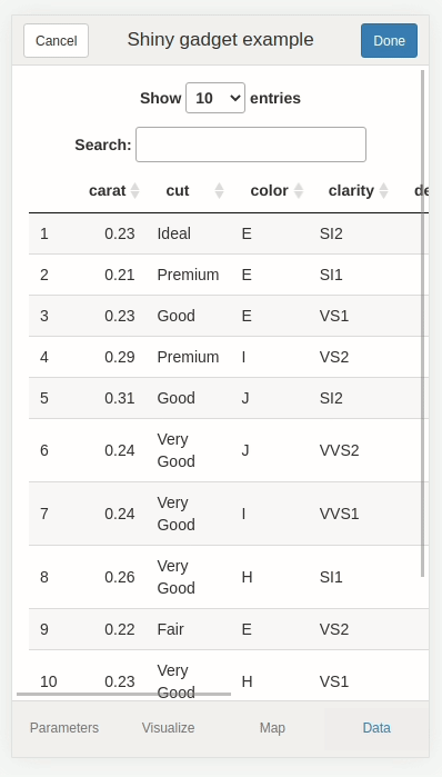
What is Shiny?
- R framework for creating web apps
- An app consists of UI (front end) and server (back end)
- Mainly used by data professionals to build dashboards
- Entry point into web development

Web basics: front end
HTML: structure
CSS: style
JavaScript: interactivity

Shiny generates HTML, CSS, and JavaScript for you
Can inspect the underlying web technologies using the Developer Tools in browser
🔧 Demo: Accessibility tools 🔧


🔧 Demo: Board game app 🔧
Adding alt text
Generating a Ligthouse report
Fixing issues from Lighthouse report
Every action has a reaction
- Feedback communicates the result of any interaction
Process
- Process ongoing
- Correct/incorrect input
- Action has worked/failed
- Items are clickable
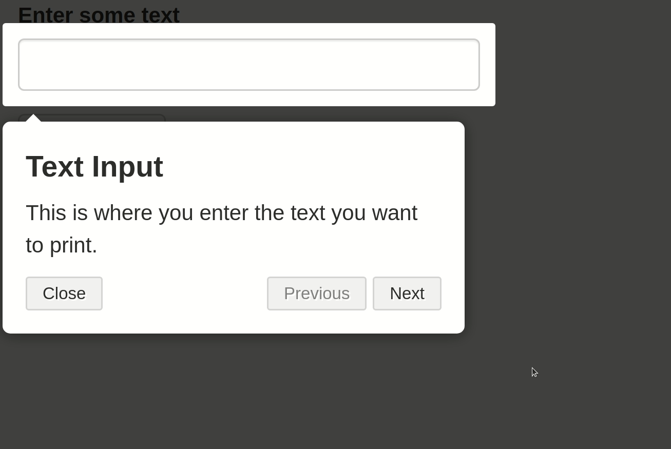
Example feedback
- Downloading…
- Enter a valid phone number
- Progress saved!
- Cursor and colour change
- Also: loading spinners, tooltips, progress bars

{shinycssloaders}
{waiter}
{tippy}
🔧 Demo: Board game app 🔧
- Improving feedback when no games were found
- Should prompt user to update search criteria
Basics
Include a “Help” or “How to Use” tab
Provide enough context for any included visualisations
Consider who the user is, and what their knowledge of the subject/content will be
User testing: how does a user interact with the app
- If you can, get an actual end user
- If not, a colleague or friend might work
{cicerone}
{shinyhelper}

{faq}
🔧 Demo: Board game app 🔧
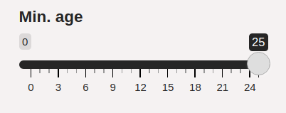
- Adding {shinyhelper} help at “min. age input”
Guidelines and tools
- Developer tools allow you to view your web page with different dimensions and even specific devices
- You can also try rotating the screen (as if you were rotating your phone screen) and zooming in on the device as well as use “touch screen”
Shiny and responsive design
Default layout
fluidPageshould resize with windowAvoid hard coding widths and heights in centimetres or inches
- Instead use relative units e.g. percentages
Mobile compatibility in Shiny
🔧 Demo: Board game app 🔧
- Try out different screen sizes in developer tools
Where to look? 👀
In Shiny
- Use h1-h5 headings effectively
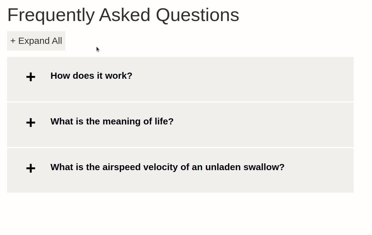
- Structuring your content into sections/tabs to avoid all content on a single page
- e.g.
navBarPage()
- e.g.
- Highlighting important outputs/inputs with size/color/position
🔧 Demo: Board game app 🔧
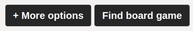
- Distinguish the “Find board game” button from the “+ More options” button using size/colour
🔧 Demo: Board game app 🔧
- Add min. age input into “+ More options”

Thank you! 🌻
Twitter: @MandyNorrbo
LinkedIn: Mandy Norrbo
GitHub: mnorrbo
Slides: mnorrbo.github.io/uiux-shiny